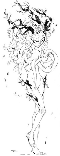
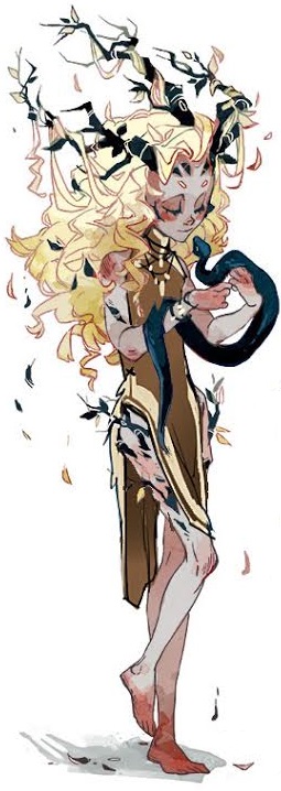
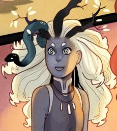
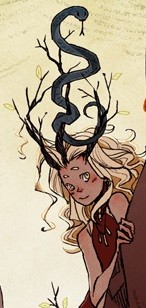
Earlier this week, I discussed the design process for the three witches, Smertae, Riata and Cait from my new comic series, Toil and Trouble with Kelly & Nichole Matthews. However, what adaptation of Shakespeare’s Tragedy of Macbeth could be complete without Macbeth and Lady Macbeth?
When I approached the design process for the human characters, it was important to me that they be very grounded in reality and match the actual history of the time, so that they would contrast nicely with the supernatural elements of our witches. The real King Macbeth lived in 11th century Scotland, so that is where my research began. I compiled a secret Pinterest board full of all the reference images I could find. Everything from clothes to ships to furniture to archaeological evidence from the time. I even traveled to Scotland to visit museums and castles, taking hundreds of reference photos.
Character Design by Kyla Vanderklugt
Remember that I mentioned it can be hard to find images from a specific area and time period and one of my tricks was to look for specific historical figures for reference? Well the people in Macbeth’s area didn’t leave a lot of records about their fashion. But the people that lived to the south of them, the Anglo-Saxons, had a ton of stuff, especially in Macbeth’s time period, where they were fighting the Normans. By looking at examples of their fashion and comparing it to Norman fashion and the few references for Scottish fashion I could find (aided by the local Scottish museums I saw on my trip), I think we were able to come up with some likely outfits for our characters. Special shout-out to the SCA (a group of medieval reenactors who do fabulous research) and the Bayeux Tapestry (a giant, embroidered graphic novel of sorts that shows the Norman Conquest of England). P.S. As a cross-stitcher, I have a special love for this tapestry because a friend told me they got to see it in person and the back is nowhere near “as nice as the front”. In your face ladies who say your back needs to look like your front!
I digress.
So where did we start with Macbeth’s design? Here is my initial description to Kyla Vanderklugt.
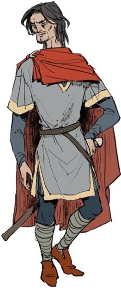
Macbeth: A man in his later middle-ages, starting to go gray. Macbeth is still very much a warrior, but is starting to pass his prime (think Eddard Stark from GoT) and his age only seems to compound itself as our story goes on. Still, when he smiles he smiles with his eyes, a dazzling forest green that still look young.
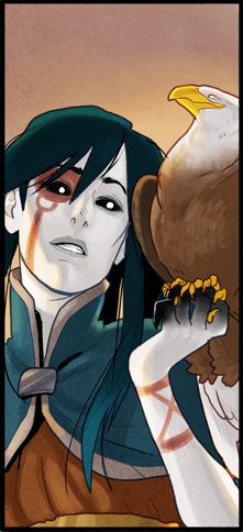
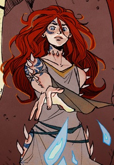
We know that Macbeth was called “ruddy” in descriptions of him, which can mean anything from darker skinned (like you see in Kyla’s design) to essentially tan from being outside, to rosy cheeked, to having red hair. We decided to go with the idea that Macbeth was dark-haired (to contrast with Smertae and Banquo, the two characters around him most often) but tanned from being outside all the time.
Art by Kelly and Nichole Matthews
Also, as I dug deeper, we realized Macbeth was mostly likely born around 1005, so he would only have been 35 at the time he became king. So you see Macbeth got aged down and bulked up a bit in the transition from Kyla to the Matthews’ sisters design. The Scots seemed to make a big deal about their kings being active and physically fit men though, so I think our final designs really fit the bill.
Nitpicker’s note: I did also find reference to Macbeth being “cat eyed” but my sources so completely disagreed on what the heck that meant, I had to disregard it.
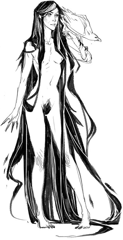
Next, to match our lovely Macbeth, we must include our Lady Macbeth to match.
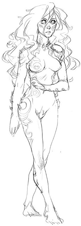
Character Design by Kyla Vanderklugt
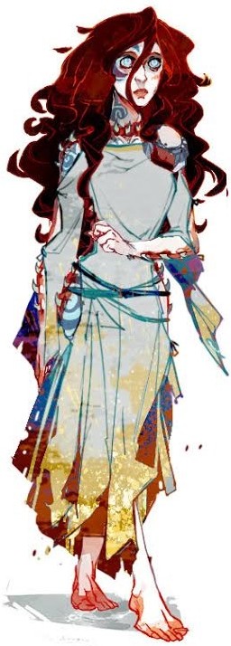
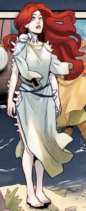
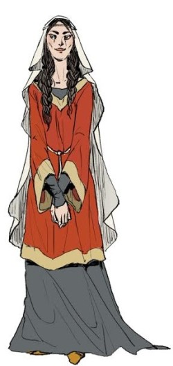
Ah, Lady Macbeth, one of the most universally hated women in all fiction. Most people don’t realize that she is also based on a real person. The actual Lady Macbeth was named Gruoch and Macbeth was her second husband. She also had a son, Lulach, that she brought to her marriage…and that’s about all we know. No age, no physical descriptions, nada. We can guess she was a bit older than Macbeth (him being her second husband and her being his first wife) and Shakespeare does reference that Lady Macbeth had a child at one point (though he never says what happened to them). Everything else is up for grabs. so here’s where we started when I described her to Kyla.
Lady Macbeth: A middle-aged dark haired woman. Lady Macbeth is the kind of perfect that’s been hollowed out by disappointment. She’s lost weight at some point and there’s a limpness to her body and her breasts.
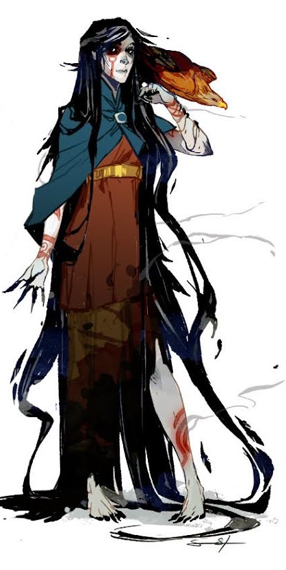
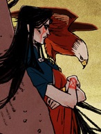
And you can see that’s exactly what we got. I love her design and you can see it transition quite well in this flashback from the Matthews’ sisters. She got filled out a bit more, especially in her flashbacks, which are supposed to be Lady Macbeth at her happiest. But, unlike every Hollywood movie ever, she isn’t 18 married to a 50 year old. And while she’s pretty, she’s not a supermodel dropped into 11th century Scotland.
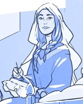
Flashback Art by Kelly and Nichole Matthews
Some sources indicate she might have had some embroidery on her clothes or more jewelry, but I preferred to give her a slightly more streamlined design so it would stay consistent. Despite my rambley posts, we are a graphic novel, not a history textbook.
Anyway, now that you’ve met the major cast of Toil and Trouble, I hope you’ll come back for more! Stay tuned for future posts looking at background design, cover design, our historical research and the scripting process.
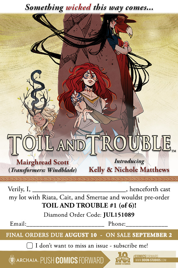
Toil and Trouble #1 will be available in stores and digitally on September 2nd and can be pre-ordered at your local comic shop with the form below or you can get a subscription at the Boom Studios website.
 Dear Readers,
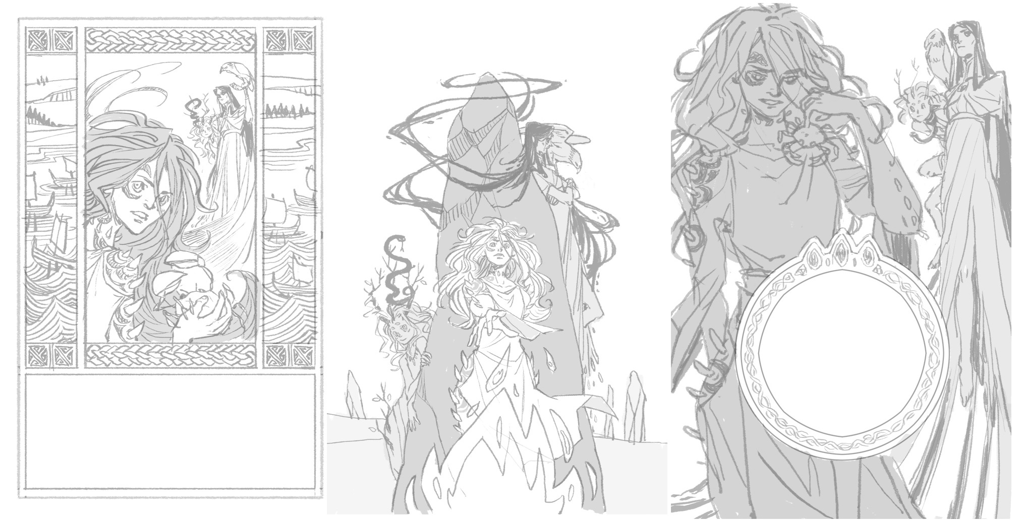
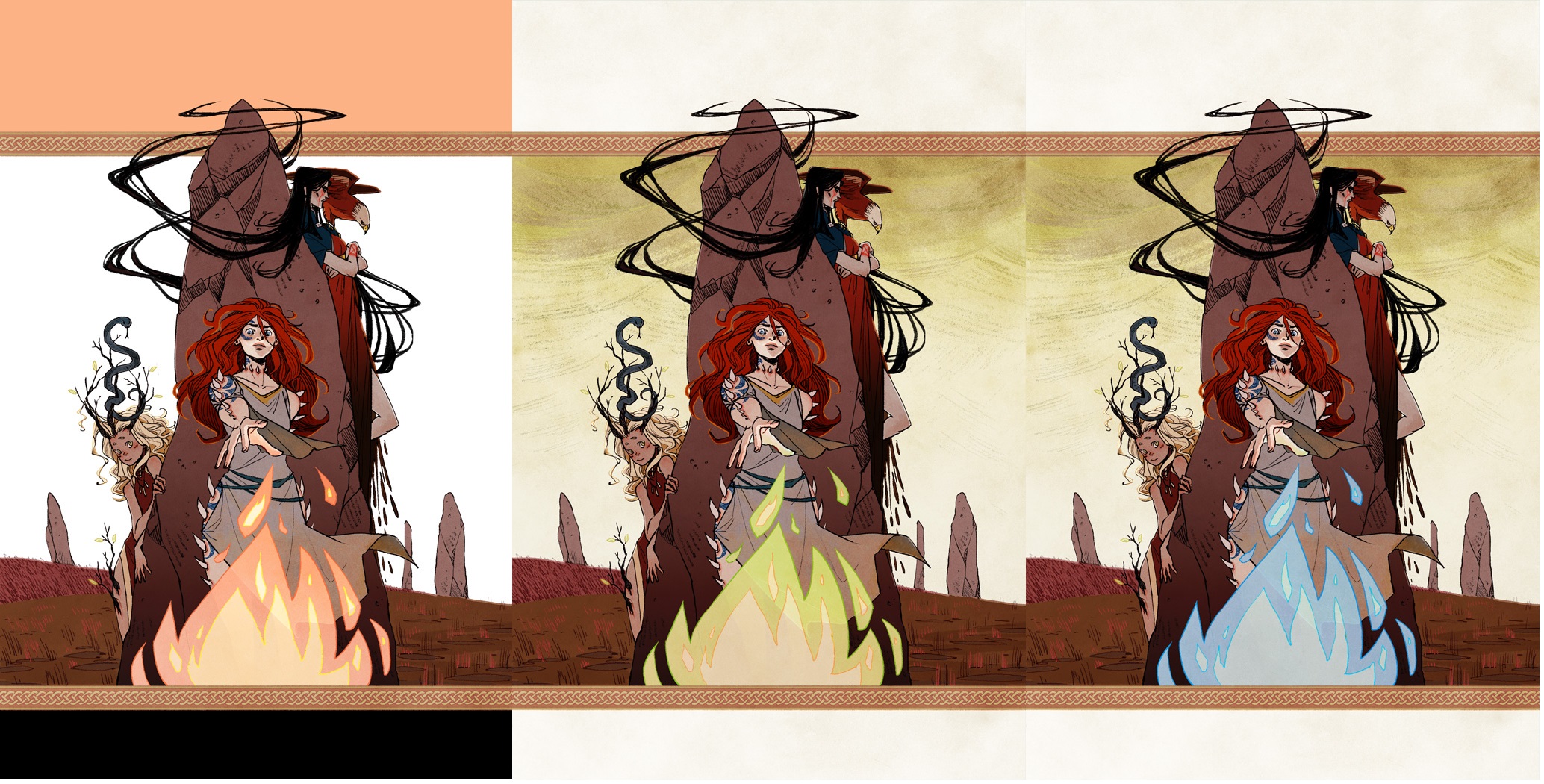
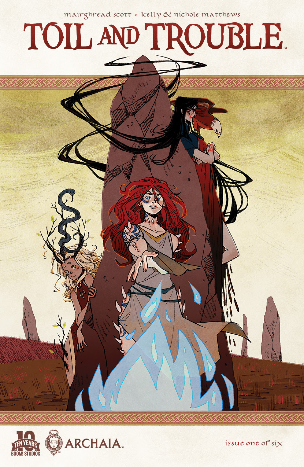
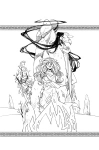 Whitney, Kyla, and I loved the design of cover 1, but felt that with so much going on we lost the witches who wanted to be the focus. We also felt that while cover 3 had a strong focus on the witches, cover 2 had the most potential for future covers following a similar design aesthetic. Whitney suggested taking the braided knotwork bands from cover 1 and adding them to cover 2 to help the series logo stand out from the image itself.