Getting the right cover can be difficult. The cover is the first image that people will see of your book and your first, best chance to sell them on it. It will be the most-shared image and the image most equated with the title. For a limited series like Toil and Trouble, we wanted our covers to have a visual theme that connects each issue. We also wanted to use the covers to show off our cast, the relationships between them, and how they will change over the course of the series.
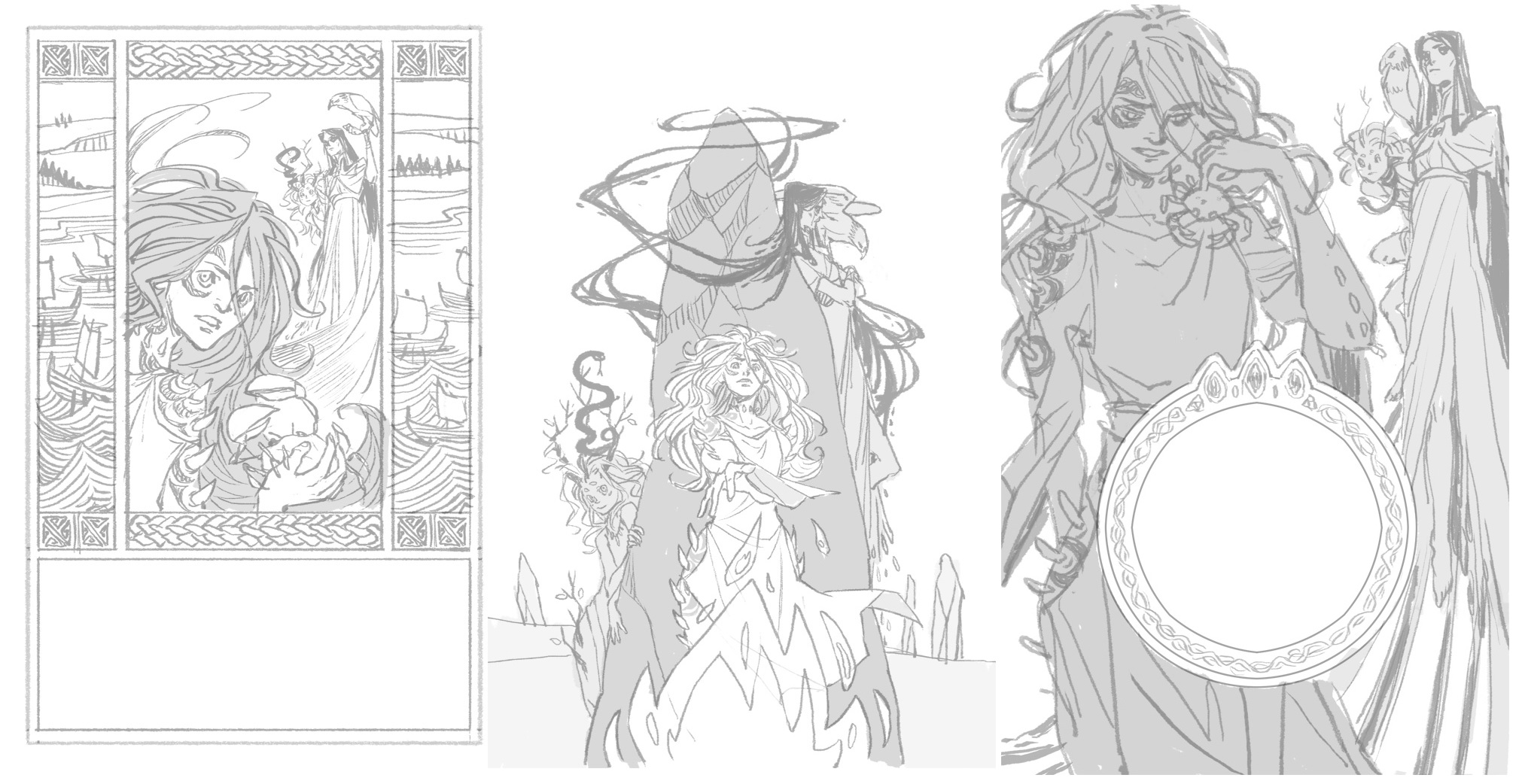
For the main Toil and Trouble covers, our editor Whitney Leopard hired artist Kyla Vanderklugt. Kyla had previously worked on Jim Henson’s The Storyteller: Witches with Whitney and her style seemed a perfect for our series. The cover process often starts with a few cover concepts. These are generally rougher sketches that show off the layout without as much detail, but as you’ll see below, Kyla went all out on her concepts to really give us a sense of what they would look like. Here is what Kyla had to say about her concept pitches:
“One’s inspired by illuminated manuscripts (I was looking at the Book of Deer) – the sidebars showing bits of scenery from the issue, here the ships arriving and maybe the standing stones in the far distance.
The second one’s more minimalistic, for this one I was thinking of a similar central composition for each issue’s cover; so this one has a standing stone, and the second could perhaps feature Macbeth and an upright war banner – that sort of thing.
The last one doesn’t have to have the circular graphic design. I was playing around with designs that looked like a crown.”
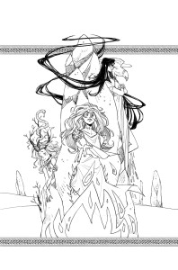 Whitney, Kyla, and I loved the design of cover 1, but felt that with so much going on we lost the witches who wanted to be the focus. We also felt that while cover 3 had a strong focus on the witches, cover 2 had the most potential for future covers following a similar design aesthetic. Whitney suggested taking the braided knotwork bands from cover 1 and adding them to cover 2 to help the series logo stand out from the image itself.
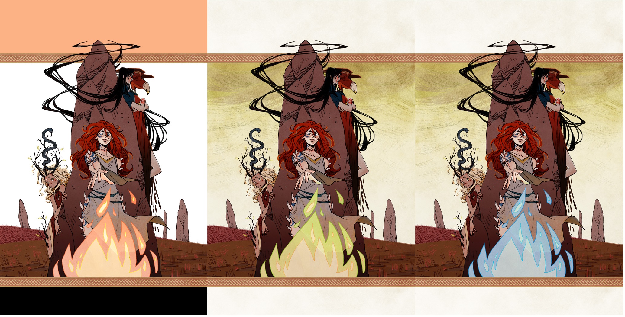
The inks looked really good so the next step was to add color. Here we played around with a few different ideas. White background, colored background, different color fires. We wanted to subtly sell that something supernatural was occurring here. These aren’t just women standing around a fire, these are magical beings. I suggested that we color the sky in that muddled yellow green that you only see during tornadoes and Whitney suggested that we change the color of the fire to blue or green to make it more magical. Since fairy fire (naturally occurring flames that happen in swamps) is blue, we went with that. Having all of these colors be natural, but still unusual to find in nature helps us ground our magic in a more real (and hopefully more unnerving) place.
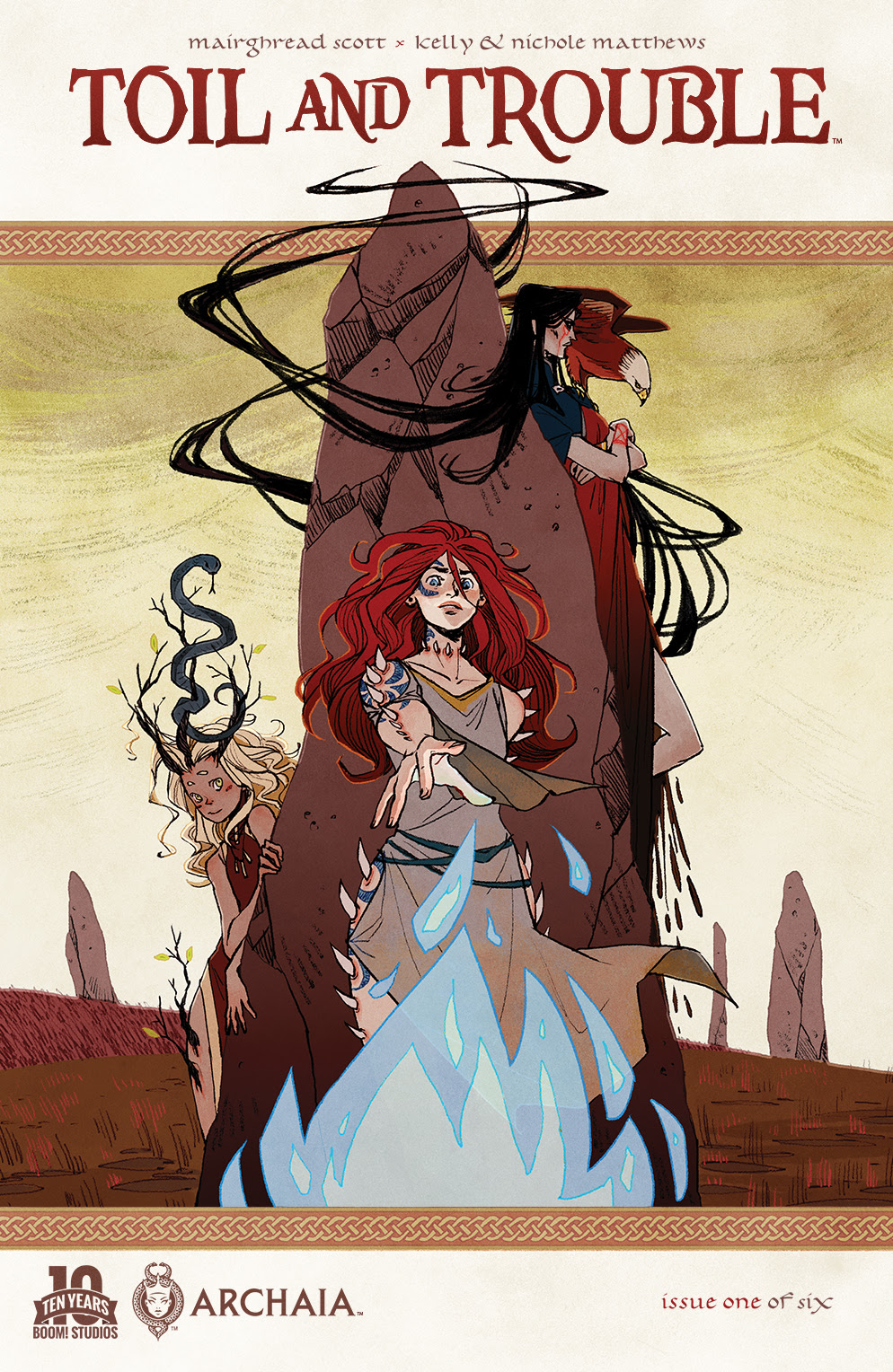
 With the colors complete, Jillian Crab designed our logo and actually nailed it right away. I love that our names are in a very old, gothic-looking style and that she kept that feeling while making the actual title a little tattered. It looks like it’s been through some toil and trouble itself. Also the gradient not only echoes the color in our braiding, but gives it a slightly ominous feeling.
 Bet you never realize so much work went into a cover! Special thanks to the art, design and editorial team on this book, they not only do amazing work, but are putting with all of my foibles and historical fact-checking while creating that amazing work.
Issue 1 of Toil and Trouble by myself, Mairghread Scott, and Kelly & Nichole Matthews will be available September 2nd at your local comic shop and on digital platforms. Issue 2 is now available for pre-order and you can get the whole series at Boom Studios website. Stay tuned for future looks behind the scenes of Toil and Trouble.
Til then, Hail and Farewell!